You’re getting oodles of traffic to your eCommerce store. You’re really proud of your products and you have an adoring set of social media fans. But why do you have more abandoned carts than you can shake a stick at?
The likely culprit is probably your product pages.
Product pages that convert browsers into customers unquestionably focus on customer experience.
Products should be explained to shoppers clearly and in detail—with not even a pinch of ambiguity. Does your product smell like a wedge of fresh lime? Does it feel softer than a newborn peach?
The more information you can give customers about what they’re shopping for, the more confidently they’ll trot towards your checkout.
Imagine rifling through a clothes rack in a physical store, searching for your favorite band t-shirt. Except the shop owner has turned off the lights, you can’t find the checkout, and nothing has a price tag.
Chances are you’ll give up and go next door.
So, how do you avoid this same fate for your online store?
How to optimize your product pages for better sales
What convinces a shopper to part with their money rather than abandoning their cart?
Here are five tips for how to optimize your eCommerce pages and get more conversions.
Get visual
Visual marketing is crucial to building an online brand and can make or break the customer experience.
High-resolution product photos that show your store’s offerings in as much detail as possible are the next best thing when customers aren’t there to physically see a product.
According to a study conducted by Invesp, 73% of shoppers said that they were more likely to buy a product after seeing a video that shows the item in more detail.
It doesn’t have to be a video though. Many images can show off the details of a product very effectively. For clothing, using models of various shapes and sizes can illustrate to the customer how it may fit them.
Patagonia displays this jacket with seven product photos and a video so that prospective buyers can see the item from all angles.
There’s no doubt here about what the jacket will look like when it arrives.
That lack of uncertainty is not only reassuring to buyers—it can also save store owners time on customer support questions and the hassle of pesky returns.
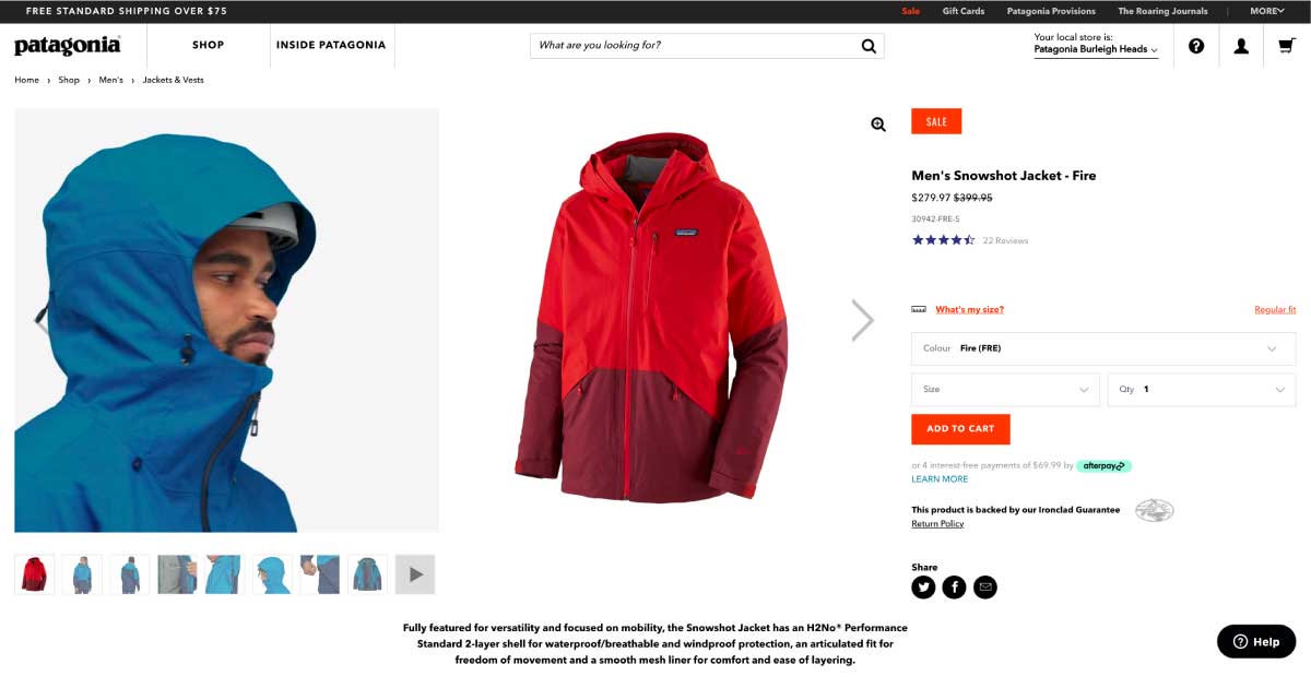
Image courtesy: Patagonia
Don’t scrimp on the detail
Creating unique product descriptions that are as detailed as possible isn’t just helpful for your customers, they will also work wonders for your eCommerce SEO (search engine optimization) and mean that you’re more likely to get found on Google.
Have you included information about the materials used to make your products? What about shipping times? Does your product have an amazing list of benefits?
Leave no stone unturned.
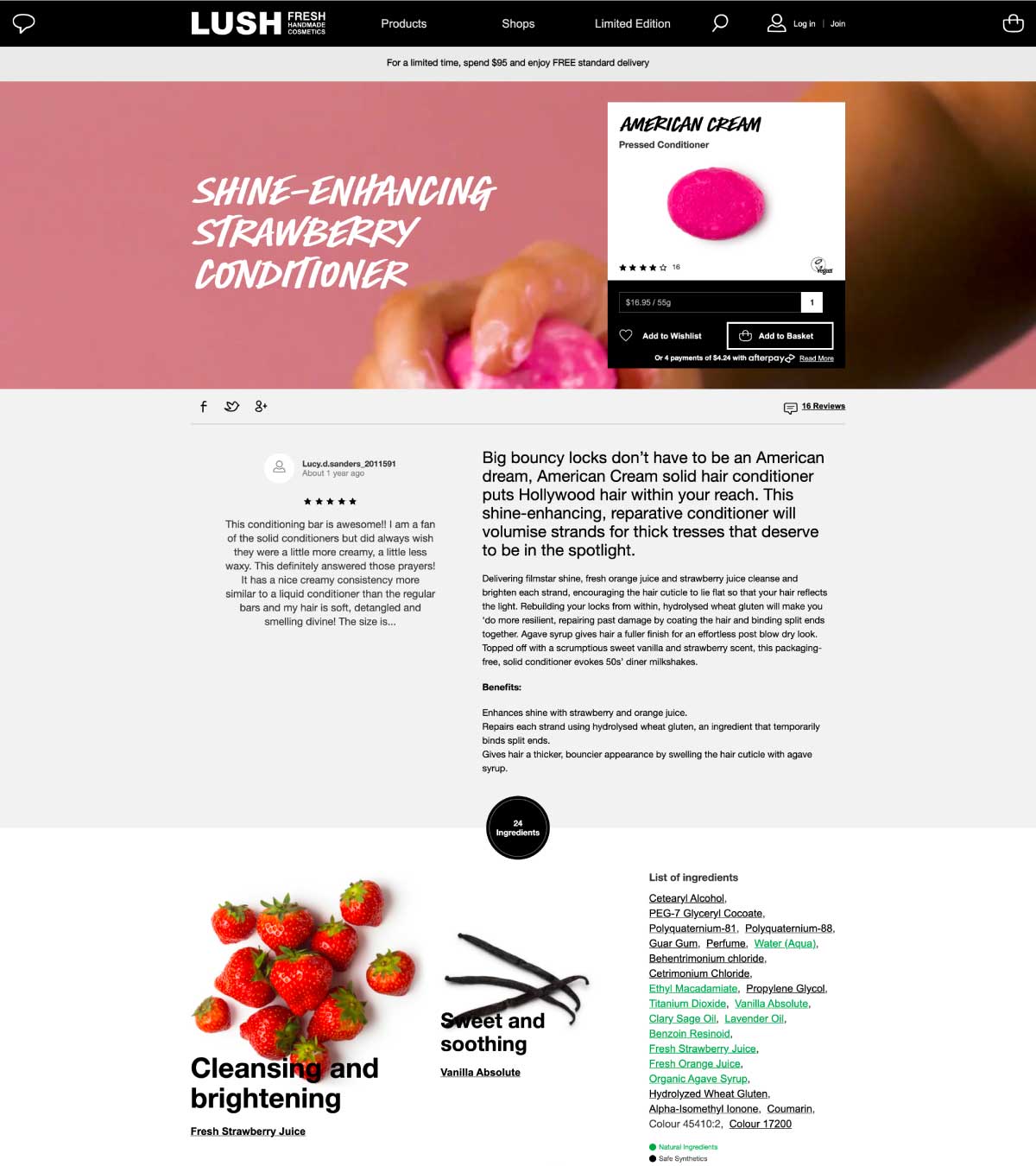
Handmade cosmetics company LUSH provides so much detail that shoppers are more likely to have every possible question answered.
Alongside product photos, reviews, a ‘how-to’ video, and a benefits list, they also provide a comprehensive inventory of ingredients and tips on how to store the conditioner.
In addition to crafting a great FAQ page, many eCommerce businesses also include specific frequently asked questions on individual product pages.
Is the product suitable for children? Does the item come assembled? Is it waterproof?
Putting yourself in the shoes of your audience can help you come up with questions that are beneficial and decrease purchase hesitation.
Images courtesy: LUSH
Social proof is everything
If you haven’t heard of social proof yet, you could be overlooking an opportunity to convert browsers into buyers.
Social proof builds trust and increases conversions by leveraging customer FOMO (fear of missing out). When customers can see that other people love what you’re selling, they’re more likely to want a slice of the pie themselves. Or the handbag.
eCommerce stores that optimize product pages effectively aim to prove to customers that others love the product.
Not only regular joes and janes, but influencers and celebrities! If you are lucky enough to get someone notable using/wearing your fine product, put that on your product page. Instant social proof in one image.
If not, the adoring words and ratings of your regular customers can do a lot toward convincing potential customers.
John Met Betty includes reviews on each and every product page so that you don’t just have to take their word for how good the item is.
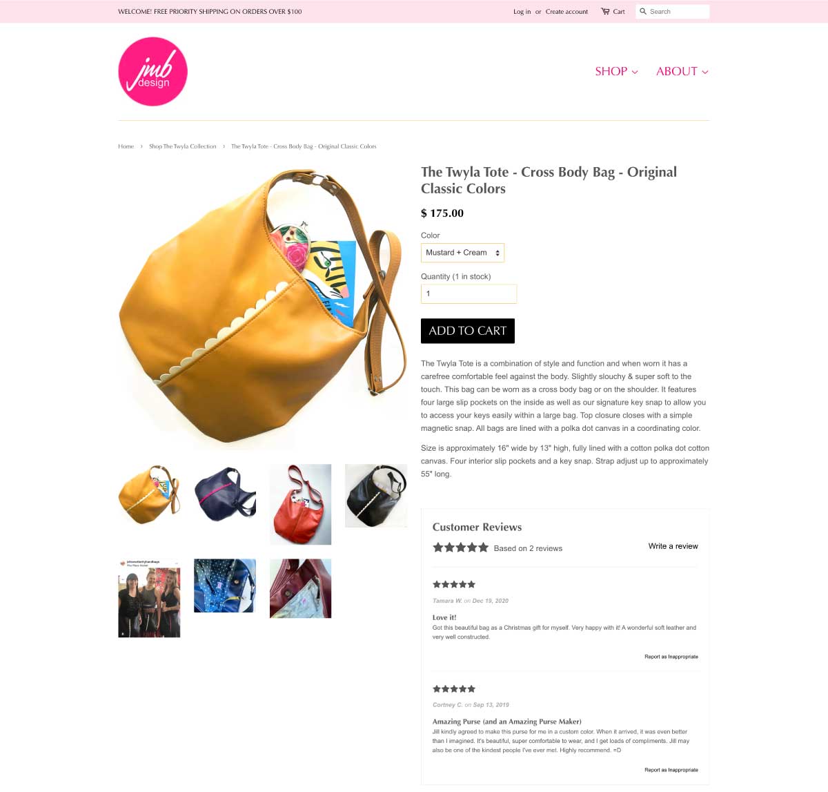
Image courtesy: John Met Betty
Calls to action
How do you move a shopper from a product page through to a ‘thanks for buying’ page?
Having clear calls to action (CTAs) that stand out can help usher shoppers in the direction you’d like really help. A super prominent ‘Buy’ button seems incredibly obvious but it can really help.
To add a little helpful complexity to this CTA simplicity, you can include related products to add to the cart with a single click. More value for the customer, higher average order value for you!
Sydney-based candle company Pretty Frank has a simple black button on a white background so that their CTAs stand out.
Implementing contrasting colors alongside logical button placement in this way helps to attract attention and make it easy for customers to identify where you want them to click.
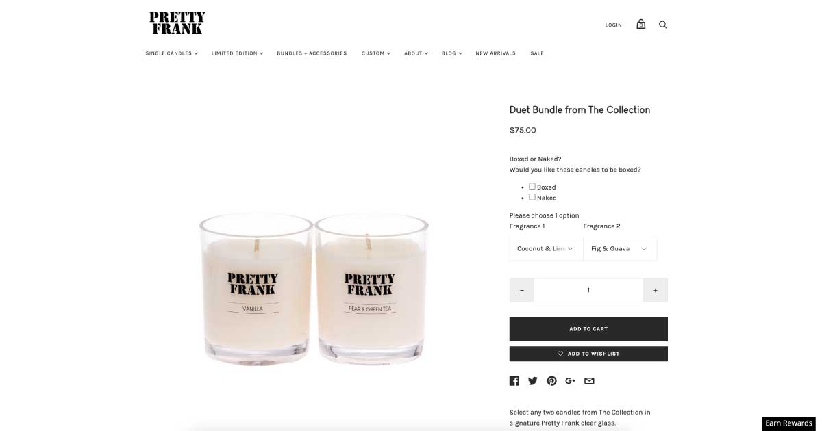
Image courtesy: Pretty Frank
Urgency
Another way to optimize your product pages for higher conversions is to create a sense of urgency and scarcity.
No one wants to miss out on a great deal because they were too slow.
According to a recent study, 60% of millennial consumers said they make a reactive purchase after experiencing FOMO, most often within 24 hours.
It’s important to note that even when creating a sense of urgency, eCommerce store owners should always aim to provide real worth to customers rather than tricking them into a sale.
Shoppers don’t want pushy sales tactics that aim to pull the wool over their eyes. For that reason, using urgency and scarcity to improve product pages should be partnered with strategies that provide genuine value to shoppers.
Sony informs customers that there’s free shipping on all orders over $200, but that the offer ends on a fast-approaching date.
If a customer was unsure about whether to purchase from Sony, they now have extra incentive to add to their cart.
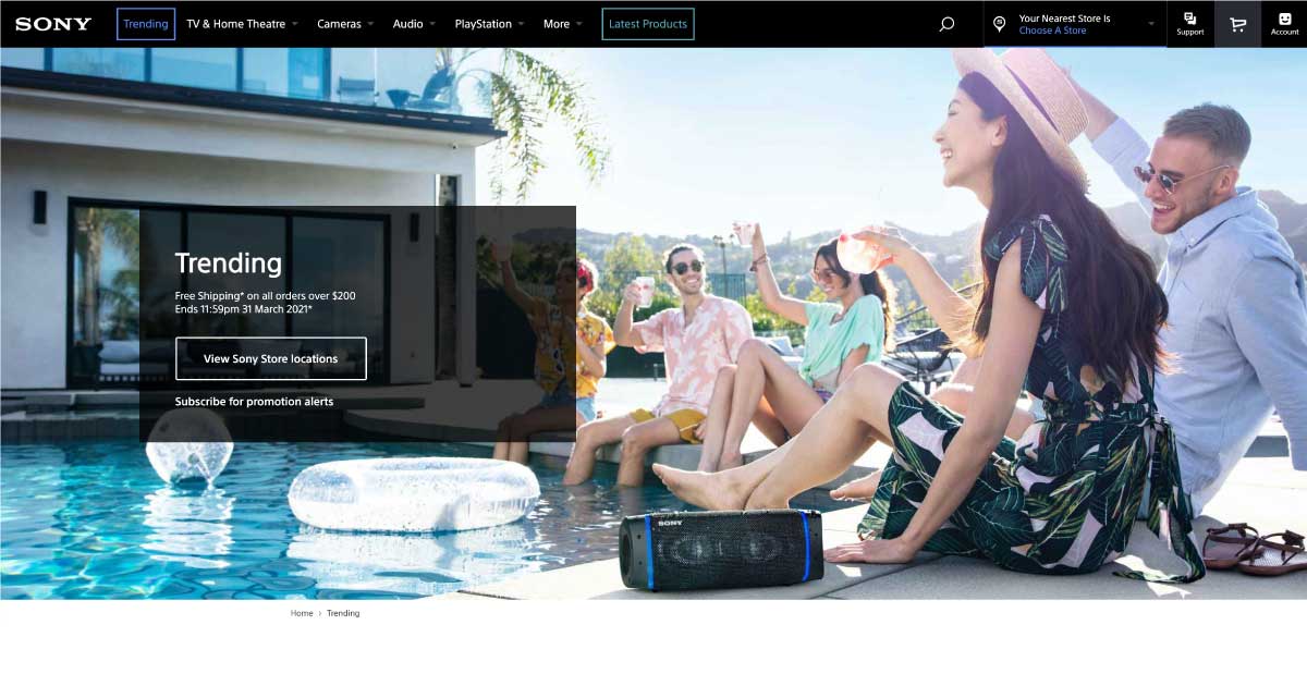
Image courtesy: Sony
Make your product pages sell for you
When you really understand your audience because you listen to what they want and need, that understanding will always shine through.
Are customers forever sending you messages on social media asking about the features of a product?
Are you getting a few too many product returns because the product wasn’t what a customer expected?
Dispelling insecurity through effective, informative product pages will undeniably generate happy customers that trust your brand and are more likely to make a purchase.

