More than half of our first impressions about a person are built from visual cues (55 percent). And our prevailing views about them are formed within the first seven seconds of meeting.
So, even before a customer has spoken with you or fully interacted with your company or products, they have likely already developed an opinion of your brand.
So, it is extremely important to choose the best and most engaging images for your website. Because you don’t want your customer’s first introduction to your brand to be meh or so-so (let alone, blah or oof).
Top five tips for creating a beautiful online store
Here are some tips you might like to consider when thinking about images and your online presence.
1. Use high-quality images
While it would be nice if poor quality pictures didn’t reflect on a company's brand or image, the truth is customers link what they see to the reputation and quality of the company. It’s unavoidable.
So, when choosing images for your site, understand that they will define your brand.
Images with large pixels and high-resolution are a crisper, clearer quality, giving your customers the best impression of your brand.
The bathroom and kitchen remodeller Carrera features high-quality images of its beautiful custom kitchens on its website. Upon entering their site, you feel like you are in your bright and spacious new kitchen.
Given the cost of a new kitchen, using high resolution, professional images helps reflect the quality of its craftsmanship and softens shoppers to the idea of this big purchase.

Source: Carrera
If your budget permits, draw on the expertise of a professional photographer who can capture your products in its best light. Or if you’re crafty with a camera, try doing it yourself.
Contemporary smartphones boast high-quality cameras and allow you to flex your photography chops.
Your phone is likely already equipped with the tools to help touch up images from cropping to brightening. There is also a range of free apps that can help with that too such as Snapseed and Airbrush.
And don’t forget that customers will navigate your website from any device, so your images will need to be mobile and desktop friendly.
Mobile eCommerce is consistently on the rise and those that do not optimize for it will take a hit.
2. Don’t leave out the human-product connection
Products work best when real people interact with them.
Your customers are discerning, so using lifeless and dated stock images are an instant kill switch.
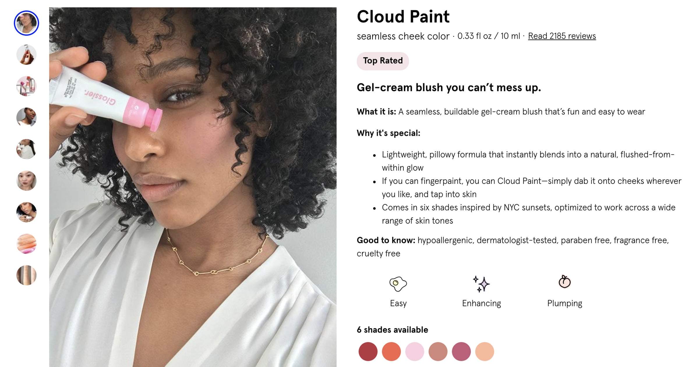
Makeup and skincare empire Glossier boasts a mix of real people modeling its products.
This shows that their products suit a broad range of customers and demonstrates how the colors translate on each wearer.
This is of the utmost importance to these customers and can help reduce the incidence of returns. Combined with amazing product descriptions, your customers are certain to understand the particulars of a product.

Source: Glossier
3. Reflect the spirit of your brand
Your images should reflect the essence of your company. The visuals should be recognizable, unique, and familiar to your product offering.
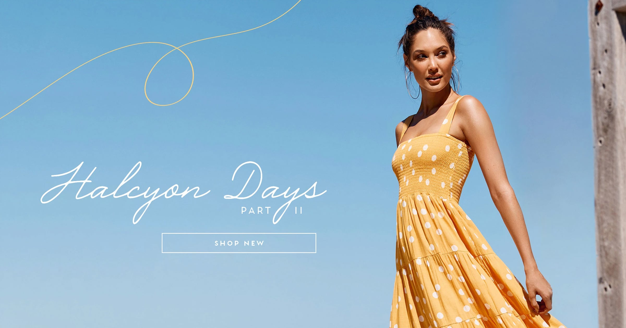
The homepage of Australian clothing retailer Mister Zimi illustrates its collection as relaxed, evoking a feeling of endless Summer.
You can see from the location, it's clear that the brand is drawing on its roots of wanderlust and exotic places.

Source: Mister Zimi
4. Share your brand story
The pictures you choose should allow your brand to weave and support its story.
While captions and descriptions are a must, not every customer will read the accompanying text. Worth at least a thousand words, a really good picture can tell your story more completely than any caption.
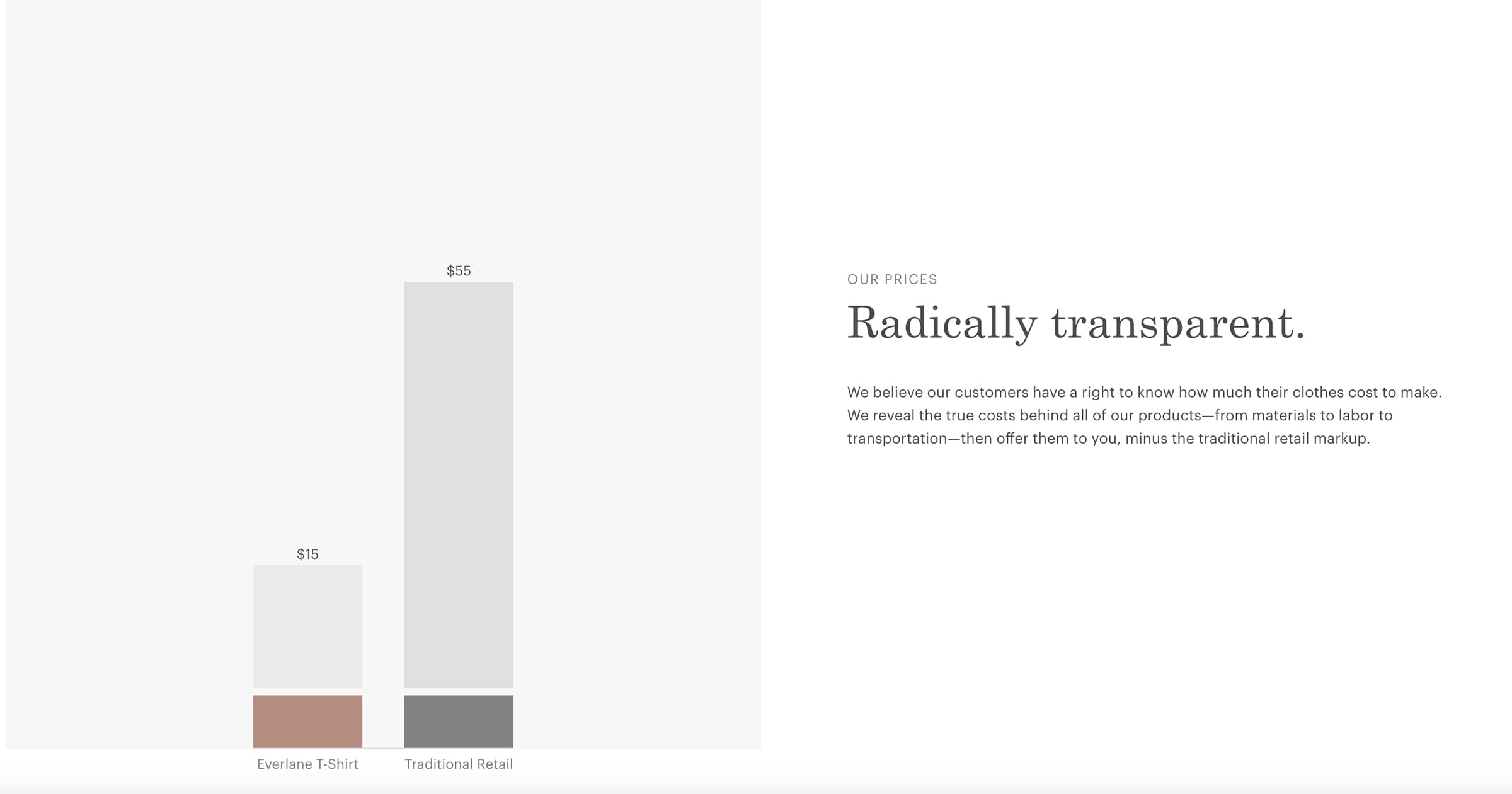
Ethical clothing brand Everlane gets the message across that its collection has a lower markup on its manufacturing than traditional retailers.
This communicates the brand is both ethical (in capping its mark up), while also remaining transparent around its true manufacturing costs.
What is your story (and value proposition) that can be told in a compelling visual format?

Source: Everlane
5. Call to action
Your images should educate your customers about your brand and guide them on how to use your products.
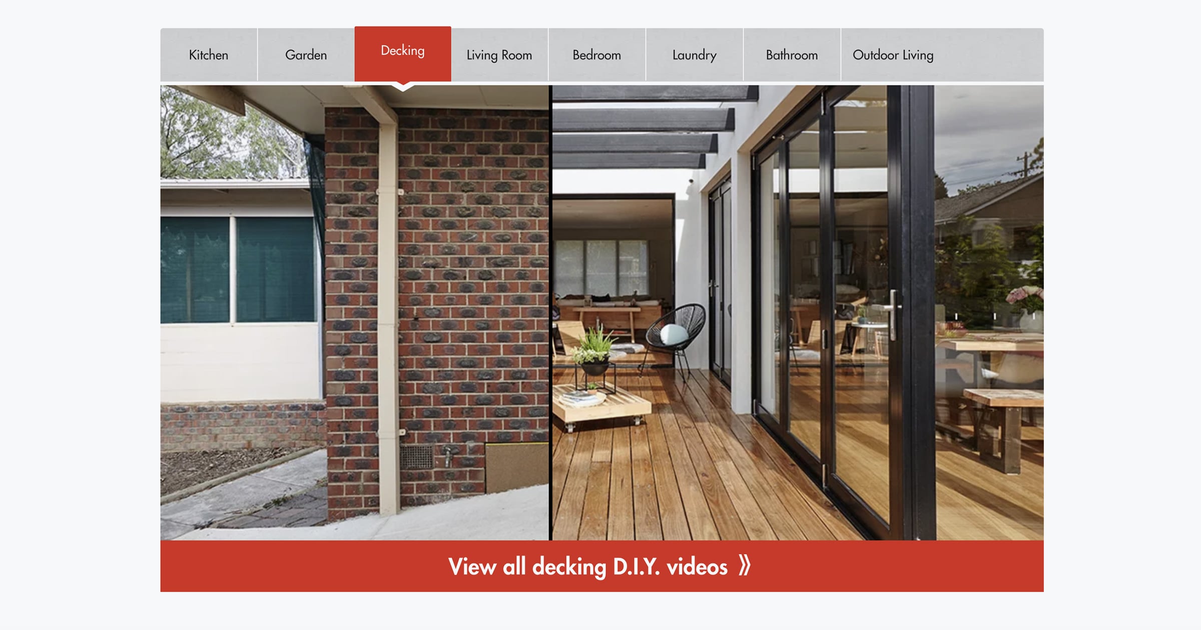
Household hardware and big-box retailer Bunnings uses before and after images to show how its decking products can transform a home.
It also points customers to a video gallery to educate them on the process and considerations for building a 'do-it-yourself' deck.

Source: Bunnings
The big takeaway
Photos and visual elements really are the lifeblood of your website. Whatever you do, do not underestimate its importance.
If you have a great eye, there is a lot that you can do yourself to make your site look amazing and definitive of your brand.
You may not be visually inclined. So, you should consider enlisting the support of a web designer and photographer to help best reflect your brand and products.
In the end, you want something you’ll be proud to say is yours and that customers will be pleased to shop around on.


