Contrary to popular belief, the term ‘user experience’ (UX, if you are cool) isn’t just a buzzword. In fact, all the cool cats and kittens in tech are making frictionless user experiences a priority. With good reason!
Now customers (rightfully) expect the same from their online shopping escapades. Not only did the world go on an online shopping frenzy during the pandemic (checkout the numbers on our Earth Day blog), but we’ve also started to prefer it over physical shopping. And there are a lot more reasons why it’s important to have UX strategies in place.
In fact, 88% of users are less likely to return to a website after a bad experience. Not only do you lose a customer, but you also risk bad reviews. And we all know how powerful customer testimonials can be as a marketing tool At Sendle, we put our customers front and center in everything we do, with their user experience in mind.
It’s nice to know that the better the experience we have, the more moolah customers are willing to part with. In fact, for every $1 spent on making UX strategies better, you’ll get a return of around $100!
What is UX and why is it important?
Let’s start with the basics. UX is the interaction—or conversation—you have with a user. For small eCommerce businesses, the user is your customer.
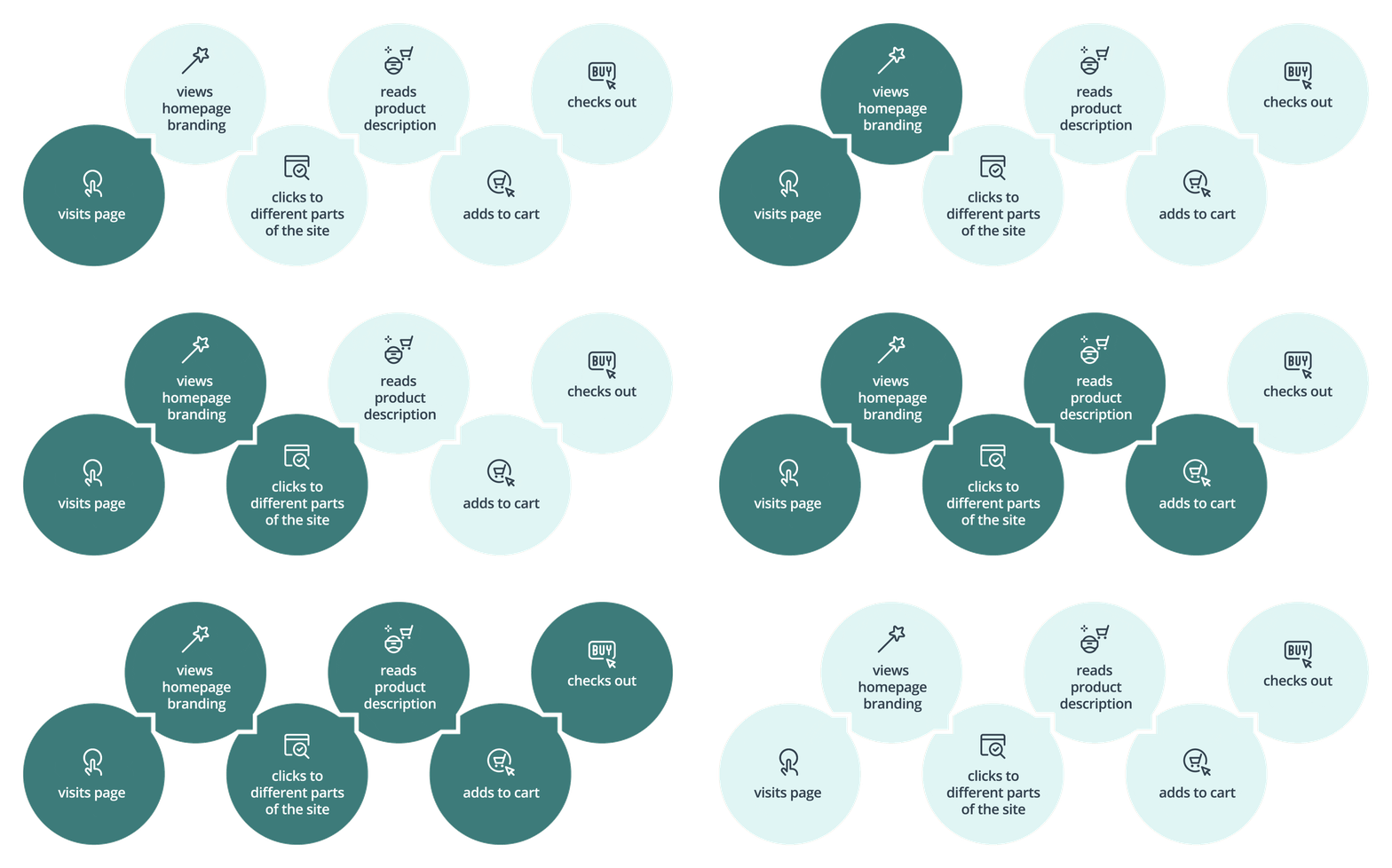
How does their experience of your site make them feel about your brand and product? The user journey begins the moment they hit your site or download your app, then while they navigate through it, and on into (hopeful) conversion and beyond.

How the user journey will go depends on the user experience
If we were to look at it more granularly, each flow of action they take while in your space contributes to the overall user experience. So, this is the way the site has been designed, the structure that leads them from the homepage to their desired product, the copy that you use on buttons, and on and on. And having good UX strategies in place keeps every element of the user experience in check.
UX strategies to create a better user experience for your eCommerce customers
The tricky thing is that since great experiences often scoot by without us noticing—on account of being so incredibly seamless and effortless—it can be hard to pinpoint why they’re so great in the first place.
Obviously, the ultimate goal is for customers to complete a purchase without abandoning their shopping cart.
But how can online retailers create excellent user experiences that are seamless, easy, frictionless, and delightful? How do we keep people’s eyeballs on the page? How do we reduce cart abandonment and increase sales?
Well, it all comes down to two key factors: design and communication. Let’s get into it.

Plan out your UX strategies to see the different stages of the user journey on your website
Using eCommerce UX design to drive them to purchase
Function is, hands down, the most important thing to focus on when designing your online store to improve user experience. That’s why user experience design (otherwise known as user-centered design) exists!
The goal should always be to make the purchase experience as simple and straightforward as possible. If there are obstacles in the way of their purchase, you’ve lost money.
Things to consider in the UX design process:
- Is it intuitive? Keep the navigation simple, reducing the cognitive load on your shoppers so they can move through the site like it ain’t no thing. For example:
-
-
- Place your shopping cart icon in the top right-hand corner for easy access.
- Categorize similar products together to reduce the effort of navigation while upselling.
- Use clear calls to action (CTAs) for purchasing decisions to eliminate any confusion on their next steps.
-
- Remove friction. Take out anything that might be stopping your customers from hitting that hallowed ‘buy’ button. It could be an untimely newsletter sign up, a distracting pop up for an unrelated item, or anything else that acts as a hurdle to that sweet, sweet ‘add to cart’ process.
- Minimalism is key in the UX design process. Make it easy to browse your site by having a clean content hierarchy, with information displayed on an as-needed basis. If customers are faced with information overload, oftentimes they’ll end up bailing from your site altogether, without making a single purchase.
Not to mention, the more you’ve got going on will slow your site speed down—and users will often abandon ship if it takes longer than 2 seconds to load (yep, we are impatient creatures). Just a 1-second delay can result in 7% fewer conversions!
Luckily, with most eCommerce platforms like Shopify, Etsy, and eBay, most of this is taken care of already. Hooray!
The Sendle package tracking page is a great example of a webpage that gives you a clear idea on its functionality
UX Design Process: Prioritize direct, helpful, and pleasant communications
Communicating clearly with your customers throughout the user journey will ensure they have a delightful experience from the moment they find themselves on your site to the moment they click ‘buy’.
- Make it obvious from the first image on the homepage what your store is about. Do you have a unique tagline that sums up your offering? Chuck it onto the hero image (above the fold) with a clear image of your product. There should be no question what you are selling.
Your product pages should also include thorough descriptions and excellent product images so shoppers know exactly what they are getting. - Develop documentation for your brand voice and tone. Use it throughout your marketing, product, and support communications.
Using a consistent message and voice across all of these touch points will build much-needed trust with your customers. Hello, repeat business! This document can then serve as your basis for all succeeding eCommerce UX strategies and content material. - Make it super obvious what’s coming up next. After a shopper adds stuff to their cart and within the checkout process, use clear content and CTAs to manage expectations.
This becomes especially important when they are handing over their precious payment information. They need to feel secure in your care.Even when they complete their purchase, you should have a shipping landing page that lays out what they can expect as they excitedly await their package. - Don’t be afraid to ask for feedback and conduct customer research. Learn from your visitors, even the ones who bounced from your site. Find out why they left your site or didn’t like their experience. Then fix it.
A great way to do this is to run regular surveys (using a tool like Google Forms, SurveyMonkey, or Mailchimp), and get them in front of the people who abandoned your site without purchasing.
If you don’t have their email yet, you can get the surveys to them by using paid retargeting campaigns (via Google, Facebook, Twitter, and more). These are rather cheap ads to run.
Alternatively, keep your finger on the pulse by sending the surveys via good old regular email to your customer list, and offer a gift or discount in return. - Offer ongoing customer support. GreateCommerce UX strategies can be undone in seconds if the follow-up support isn’t up to scratch.
A perfect example is in the refund or exchange conversations via email or chat. It is super important to offer ongoing and quick customer support for returns or exchanges.

Use clear and visual messaging to keep your customers on the right track
Make your store inclusive and accessible
While you may sell a very niche product, you should still be trying to serve as many people as you can. One way you can reach more people is to make your site as accessible and inclusive as possible.
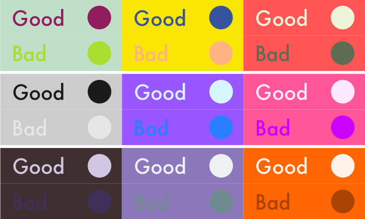
- Formatting. Make sure your site’s layout is well-spaced, the font size is large enough, as well as having proper color contrasting (for example blue font on a purple background would be considered a bad color contrast).This will help people with vision impairment or low vision purchase things from your store.
- How does it read? Run any words you write through a tool like Readable to gauge the general level of your writing.
In the US, it’s recommended to keep language to a 7th-9th grade reading level as studies show that’s the easiest for people to absorb (yep, even if they’re highly literate, accomplished-yet-busy professionals).
- Run a screen reader over your site. You can use VoiceOver on your Apple devices or TalkBack on Android. This will pick up any inconsistencies with buttons, labels, and forms for those who have vision impairment. Plus, it’s perfect for your checkout process!

Your choice of colors can be a huge obstacle for potential customers viewing your website | Color contrast chart via Pinterest
The importance of inclusivity in UX strategies
It’s more important than ever to make sure your imagery and language are as inclusive and diverse as possible. This plays a huge role in the experiences customers have on your site.
Can they see themselves in your brand and marketing? Do they feel welcome and safe in your space?
For example: Make sure your language isn’t full of local slang or jargon if you’re selling to a global audience, and do a quick sense-check to make sure none of it could be construed as offensive.
Make shipping a breeze with Sendle
As if we could end without mentioning this.
Assuming you did everything else right and they purchased your stuff, the end of your user’s experience will be when they receive your fine goods. This is where Sendle comes in your UX strategies.
Ensuring your customers’ shipping experience is seamless, transparent, affordable, and reliable is kind of our jam.
It’s a fact that getting a package delivered is one of life’s true pleasures (especially when some of us are cooped up in our homes and shopping online to pass the time). Which is why making the shipping a considered part of your overall customer experience is a no-brainer.
Customer experience tips for Sendlers
By including your customer’s email when shipping with Sendle, you’ll ensure that they get real-time updates from the tracking page. No need for them to follow up with you! Plus, we have a whole section of our help center dedicated to various receiver questions.
But the best bit? Having shipping synced up with your checkout process means you don’t need to waste any more brain juice on this important step—especially with our eCommerce platform integrations!
If they have a good experience getting their stuff from you, you have likely won yourself a repeat customer. Great work!

Sendle is committed to creating a smooth customer experience journey
UX strategies are key in eCommerce businesses
We’ve merely touched the surface (there will certainly be more to come)!
By ensuring you have the basics covered, you’ll already be a step ahead of your competitors and raking in that ROI.
The key things you should focus on are keeping your UX design intuitive, simple, and minimal; using clear, consistent, and kind communication; offering valuable support where you can; and reducing overall friction for your customers.
And having UX strategies in place ensures that your brand is consistent and that it delivers—just like Sendle.

