- Thanks for subscribing.
Thanks! We’ll be in touch soon.
Thanks.
Boring, boring, boring. The sound of a million cursors exiting a page.
CLICK.
What is a Thank You page?
A Thank You page is what your customer or lead sees once they’ve subscribed or purchased. Too many businesses are guilty of just popping something quick up and leaving it at that.
While it may seem like an afterthought type of page, it’s actually quite important. From copy to content to design, an effective Thank You page can do a lot.
The thing is, these pages are huge opportunities for your business. They can be wielded in several different ways to achieve your bigger business goals.
How a Thank You page can help your business

If somebody (with an abundance of great taste) has found themselves on your Thank You page, it means they found you interesting enough to take action. They decided to purchase your amazing baubles or give you their personal info.
Thank them right and the reward is yours.
By simply saying ‘thanks’ and sending them on their way, you’re blunting that momentum you’ve created.
To fully take advantage of their good spirit, here are some ways you can use that post-action moment:
1. Learn more about your customers (for science)
Ask them to complete a short customer survey while they’re there.
You respect their time, so keep it quick and simple. It never hurts to tell them how long it’ll take (e.g “Take 60 seconds to answer some questions to help us improve?”).
Grabbing these little bits of customer info is an enormous data win for your marketing efforts.
You can also use this time to get customer feedback, which—if capitalized on—ultimately makes your service or product better.
2. Increase sales & conversions
They’ve just taken the consequential first step of signing up for your newsletter/subscription/rewards program/etc.
They’ve entered your funnel. And, you want to keep in them moving through.
So, use your Thank You page to direct them to some of your best content or products instead of just a dead-end. This draws them back into your website, effectively moving them further along the sales funnel.
You can even give them a special offer as a thank you for signing up! Glowing testimonials and other social proof are a great addition to help drive up your conversion rate.
3. Build brand awareness
It’s great that you have that social-sharing widget on every page, but it’s usually a case of ‘ask and you shall receive’.
It’s better to tell them what they should do. Use the Thank You page to encourage users to follow you on socials, share your website with their friends, or check out your super hip podcast.
Make your great customers into brand ambassadors, driving their network to buy from you.
Anatomy of a Thank You page

No matter which goal you hope to achieve, there are some absolutely essential elements for any Thank You page.
1. A confirmation message
Whether the user signed up, made a purchase, or booked a meeting, having a quick message confirming that their action was successful makes for a better experience.
Follow this up by outlining what they can expect next, like approximate days for shipping or an email they should look out for.
Keep it simple if you like, or get creative with your messaging.
2. A strong CTA
If you don’t have a CTA (call to action) on your Thank You page, your visitor will most likely just leave.
You’ve worked so hard to get them to your site though. Do you really want to let them go so easily?
The ‘best’ CTA for you depends on your objectives and where in your sales funnel the user is.
Some examples:
- If they’ve just signed up for a course, you could prompt them to open the first lesson.
- If they’ve just signed up for your email list, you could direct them towards some relevant blog posts.
- If they’ve just bought something, you could go for the upsell by showing them other related products, or some content about how to get the best use out of the product they just bought.
- If they’ve just bought your stuff, ask them to refer their friends for a discount. Increase loyalty while nabbing new customers in one go. Woo!
The possibilities are endless, particularly as you can have multiple CTA goals (unlike a landing page).
Just make sure you have an idea of which one you’d MOST prefer the user to select, and make that one the biggest and most obvious thing to click.
3. Next Steps
Not quite the same thing as a CTA.
Whatever your users need to do next, point them clearly to it (for example, access an asset they just signed up for).
If their download should’ve started automatically, tell them that. If it’ll land in their inbox, say that. If they’ll be contacted by someone on your team within 2 working days, tell them!
Be clear with your customers and they’ll stay happy. Customer service win.
A great Thank You page example
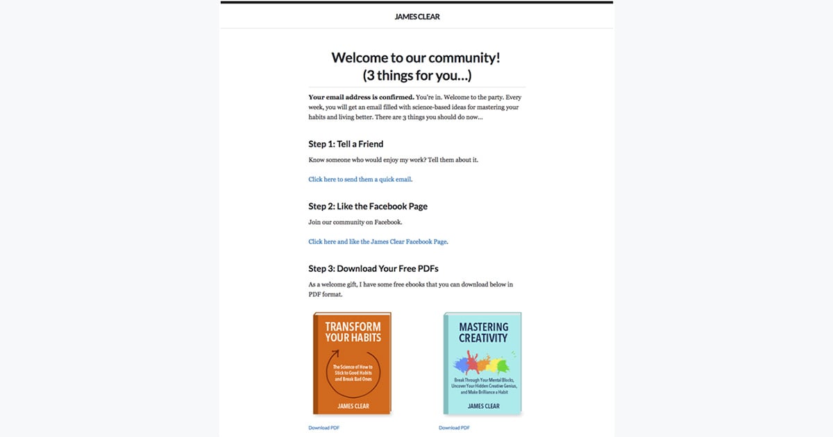
This Thank You page on James Clear’s site is a perfect example of all these elements.
He confirms that we’ve successfully signed up (and restates the benefit of what we’ve signed up for), prompts us to tell a friend and join his Facebook community, and also shows us how to download their free, bonus PDFs.
Simple, clear, and effective.

Thank You page best practices (improve your ROI)

You want your Thank You page to have an impact on your business. Every page on your site has its own reason for being there. The biggest reason is to help grow your business.
Here we've got some best practices for a couple different scenarios.
If they have…
...just signed up/opted in
If they’ve already signed up, it means they like you, your brand, and the educational resources you have to offer.
Here are some tips to draw them further down your funnel:
- Point them to more resources on your site (blogs, whitepapers, PDFs)
- Invite them to a webinar with an ‘add to calendar’ option
- Invite them to book and try out your service
- Offer a limited-time-only discount offer or voucher
- Offer them a (one-off) product or service at a super discounted price
- Offer a free consultation or demo
- Show off your testimonials or other social proofs
...just purchased from you
If they’ve already handed you their money, your thank you page should be more focused on retaining customers, increasing order value, and creating brand advocates.
Here are some things you can try:
- Go for the upsell by showing them other products. Go with whatever works for your business, whether that’s more expensive products, related products, accessories, etc.
- Offer them a discount or voucher to encourage them to return and spend more.
- Offer a reward for referrals and reviews. By turning them into brand ambassadors, you’ll encourage their own repeat sales (not to mention new customers) and drive them to create social proof for your brand, thus wooing new customers.
- Make an effort to surprise and delight your customers. Whether it’s with a cute or funny animation on the thank you page or some type of coupon or reward, giving them something to talk about will boost your word of mouth business. This is invaluable.
Now you know, you don’t have any excuse to keep that boring old Thank You page. Go forth, experiment with it, and see how an optimized Thank You page can benefit your business!


