You should know that when people visit your eCommerce store, they’ll likely take a gander at your About Us or Meet the Team page. In fact, 52% of people want to see the About page when they first visit a site.
Shoppers are curious and want to know all about who they may be buying from.
Keep in mind that there are loads of fraudulent sites out there. So you’ve got to give shoppers a reason to trust your business, removing any doubt about your legitimacy.
So, in order to gain their trust, you want to create a page that earnestly describes you and your business. It’s going to determine whether people stick around and buy or go elsewhere.
But, you might say, nobody reads the About Us page. Why should I focus on that?
Total myth. They really do read it!
It serves as your first impression builder. It’s a part of your marketing plan. The better written, the better the response from your customers. Remember that just one customer has the potential to capture five more.
Many store owners don’t know how to write an effective description of their business. And, that’s OK!
We’ve put together some guidelines and a bunch of really great About Us page examples for you.
How to write a powerful About Us page

There are a number of things you need to focus on when creating your About Us page. Let’s tackle the big ones.
Know your audience:
When you are writing, consider who you are writing for. For example, if you have an eCommerce store, then your main audience will likely be adults between 25 to 44 years old. If you sell baseball memorabilia, you know what type of person you are speaking to.
Develop trust:
The next thing you need to do is develop the trust of your audience. For that, think of a few questions to ask yourself. Such as:
- What value are you providing?
- Why should the buyer buy from you?
- What is unique about you? What is unique about your mission or products?
These questions will help you form a framework from which to write.
Again, in order to develop the trust of your customer, you should add your location (though maybe not your complete address as there might be scammers out there). City and state will do just fine.
Keep it simple and make it personal:
Be careful not to go overboard with your About Us page. We know you want to impress with big words and ideas but that isn’t always as impressive as you may think.
No one likes to read things that they can’t understand. If you are going to use fancy words, be certain that they are easy to grasp.
Further, people want a relationship with the brands they buy from. Introduce yourself and your brand like you are talking to a new potential friend.
Testimonials/reviews:
As with any eCommerce site, reviews go a long way to gain your customers’ trust.
Don’t bother with fake reviews. Sooner or later, your very smart shoppers will find out. And, you do not want to know what will happen then. Use honest reviews from your amazing customers.
What to avoid in your About Us page

Knowing what not to do can be just as effective as knowing what to do. So, here’s what you should avoid when creating your page.
Making About Us about you:
The biggest mistake that people make when it comes to creating an About Us page is making it all about them.
Your About Us page is about what you can do for your customers. Tell them how you can help them, what solution you provide, and how they will benefit from what you offer (more than from anywhere else).
Your page is overly long:
Trust us, nobody wants to spend their precious time scrolling and reading your novel entitled About Us. So, keep it short and engaging while rich with value.
With all of that, here are some examples of pages that did it well. Hopefully, this will give you more clarity when creating your own.
11 examples of the best About Us pages
The proof is really in the pudding (whatever that actually means), so let’s take a look at some real pages out in the eCommerce wild.
What do they get right and why does it work?
1. Shopify
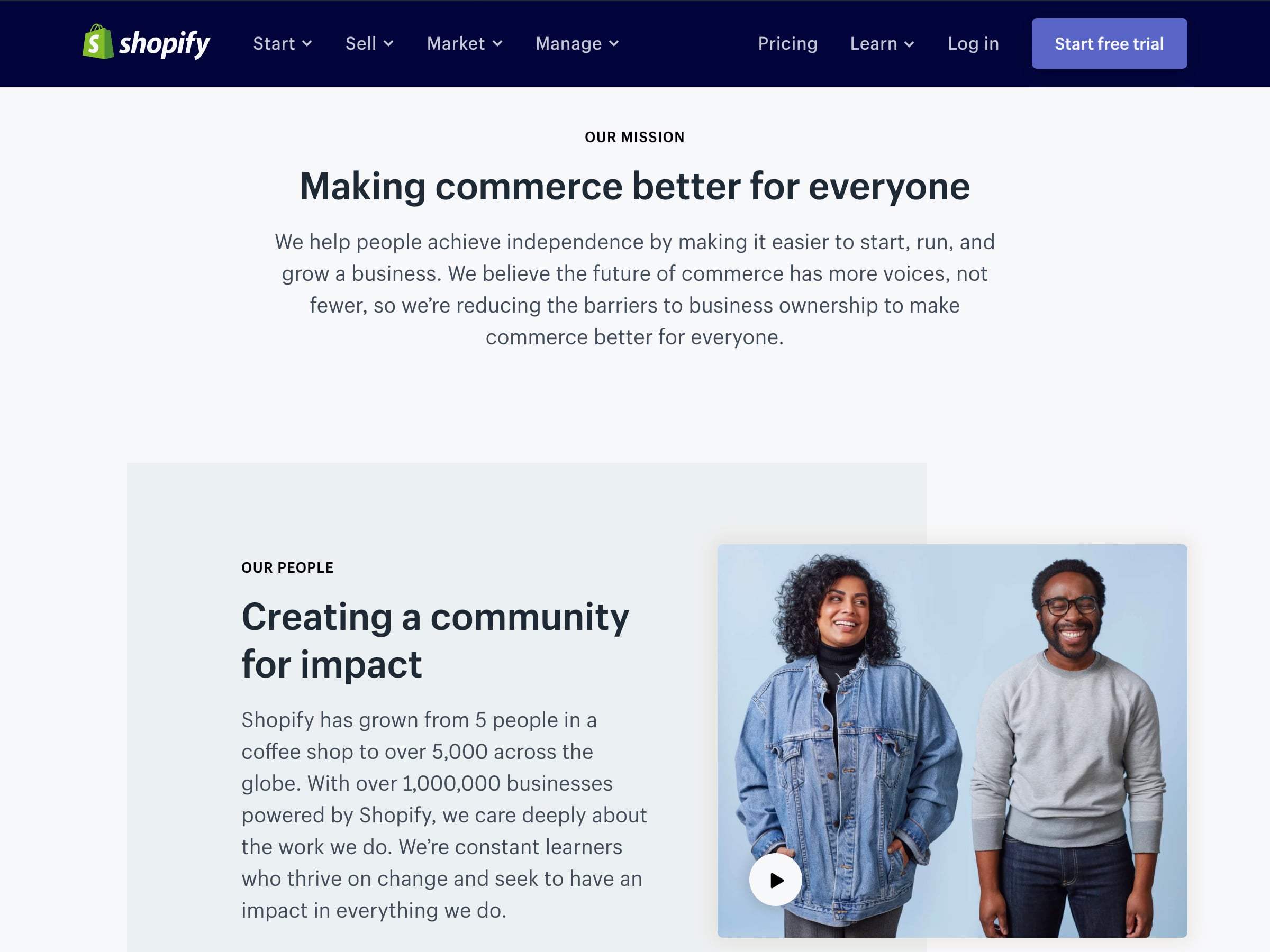
We all know Shopify. For those living under an eCommerce rock, Shopify is a platform for selling products.
Developed for small businesses, it is easy to set up so storefronts can be put up quickly to start selling quickly.
Take a look at their About Us page. With just one short and easy-to-understand paragraph, they lay out what they do and how it benefits you. Their mission is your reason to use them.
2. Amazon
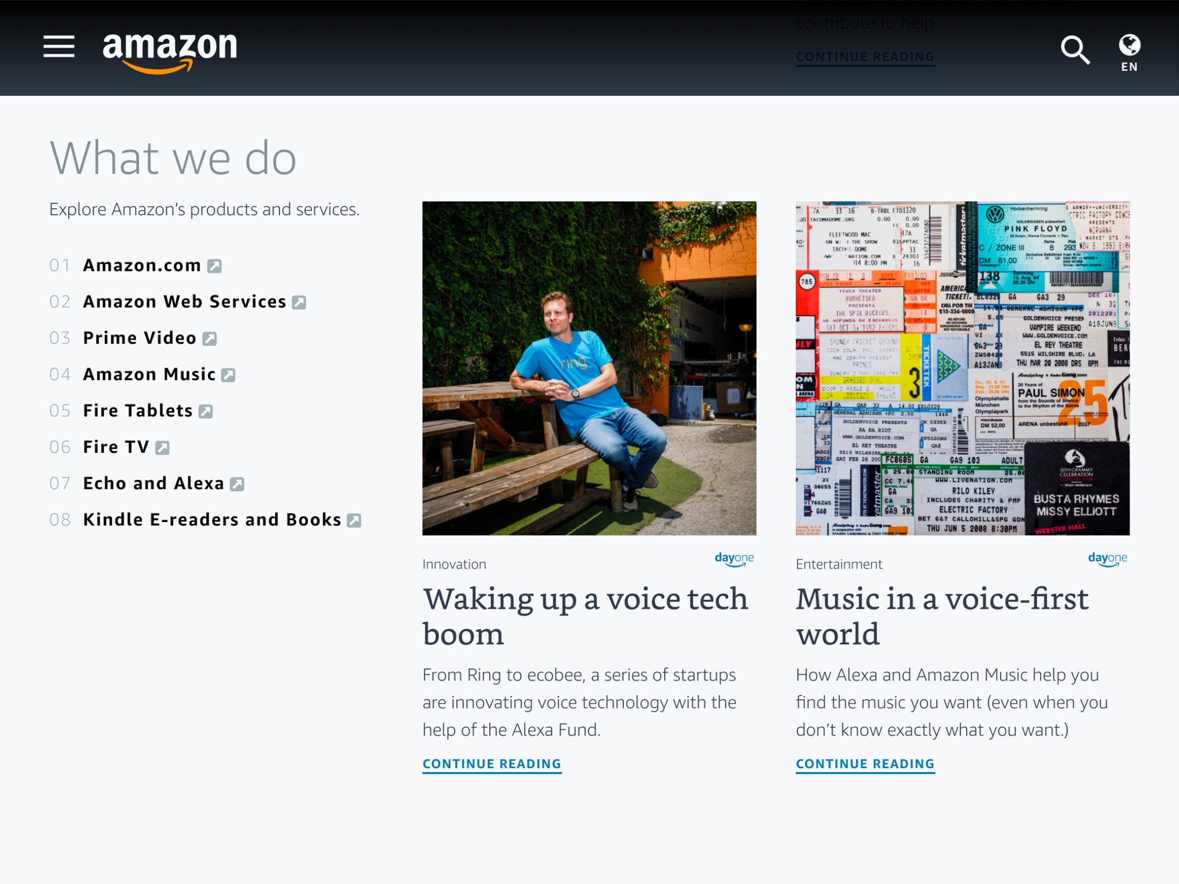
Again, starting with the big names here. Needing no introduction, Amazon is the biggest name in eCommerce.
In their ‘What we do’ section of their About page, they list all the various services they provide. Above this, they also talk about their mission and goals, giving the curious the opportunity to read more deeply about everything they strive to do.
But, in this section, you get the quick rundown of what they offer you as a customer. You immediately understand what you can expect from Amazon.
3. Walmart
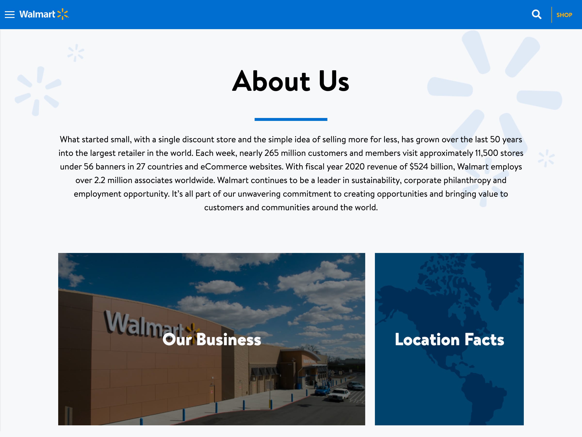
The last of our behemoth companies, we’ve got Wal-Mart.
In this example, Walmart has put together a compact About Us page. They simply describe where they came from and why they do it.
They impress with their large customer base and easy accessibility and speak to how they stand out from competitors.
4. Beardbrand
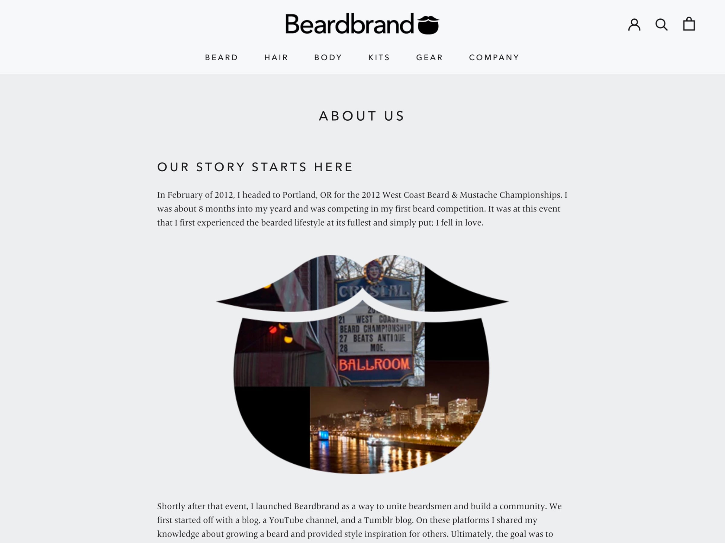
Small businesses like Beardbrand can do a lot with a good story. Beardbrand is a unique brand that comes with a narrative.
They go long, which can work. They talk about how the brand came about with a story about growing a massive beard (a yeard is an uninterrupted growth of beard over the course of one year, by the way).
Knowing that other beard enthusiasts might also appreciate specially made products for beard grooming, they created Beardbrand. With effective design and a compelling story, they’ve created authority in this niche space.
5. Package Free Shop
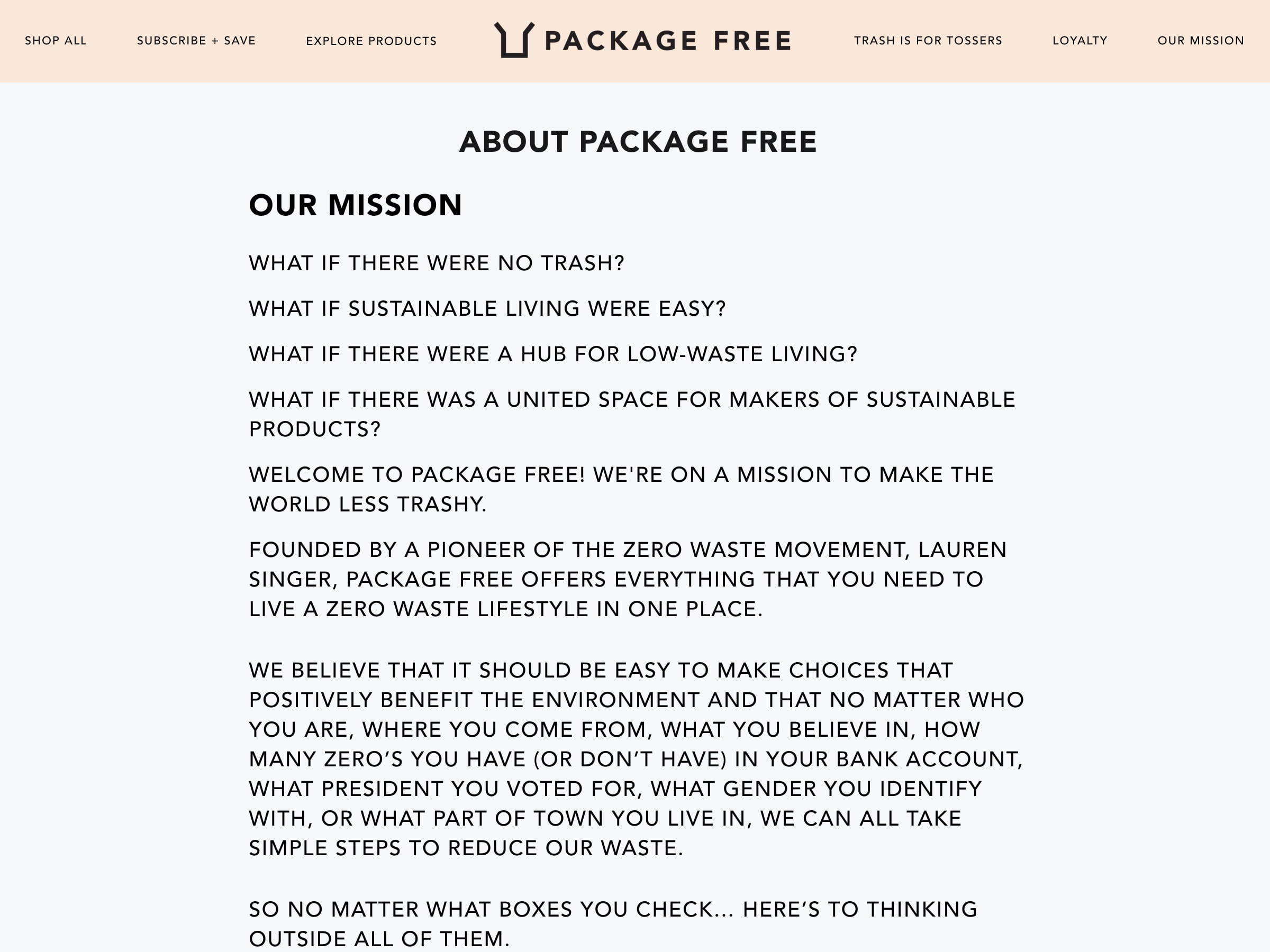
Package Free is a shop centered around the Zero Waste ideology, wherein the products (bar shampoo, metal straws, biodegradable phone cases, etc.) all strive to create as little waste as possible.
Their Our Mission page begins in much the same way as John Lennon’s song Imagine, painting the picture of a low waste world. Their mission follows these rhetorical questions.
They exist to try to create this better world of no waste.
They also back it up with data on how much waste they’ve curtailed. Instead of telling a long story about how they got there, they talk about what they’d like our story to become.
6. Birchbox
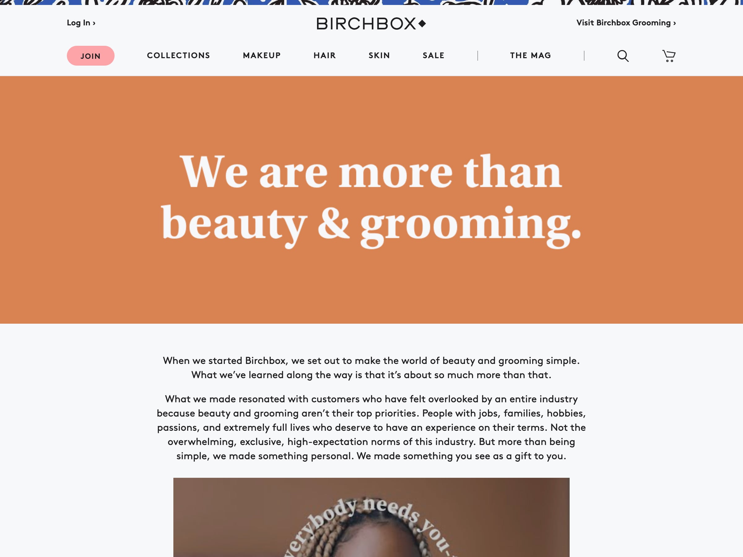
Birch Box is fairly well known these days. It was one of the first brands to drive the subscription box boom.
They provide beauty products, sold individually or in a monthly box, for regular people. Their About Us page is actually a Manifesto. In it, they make a personal connection to their customers.
It speaks to the customer’s busy life and need for self-care. This emotional appeal works for these more intimate products.
7. Hozen
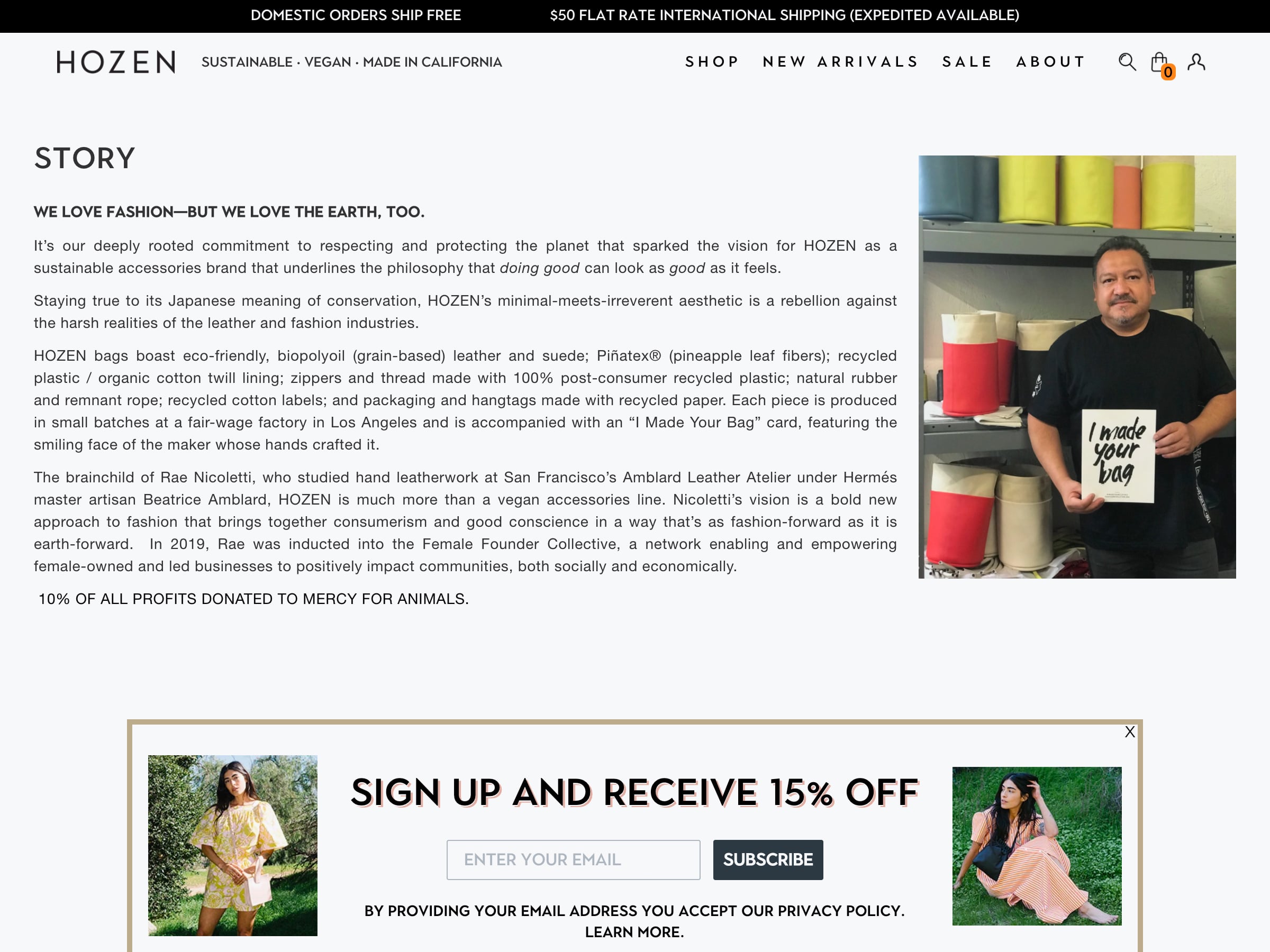
Hozen, a sustainable and vegan bag maker in California, has an extremely stripped down Story page. Their central selling point is the heart of the company: ‘We love fashion—but we love the earth, too.’
Speaking to their commitment to sustainability and fair wages, their story speaks to a contingent of shoppers that also believe in that ethos.
The story gives shoppers a reason to shop with Hozen over others while creating a connection with the makers themselves.
8. Healthy Mummy
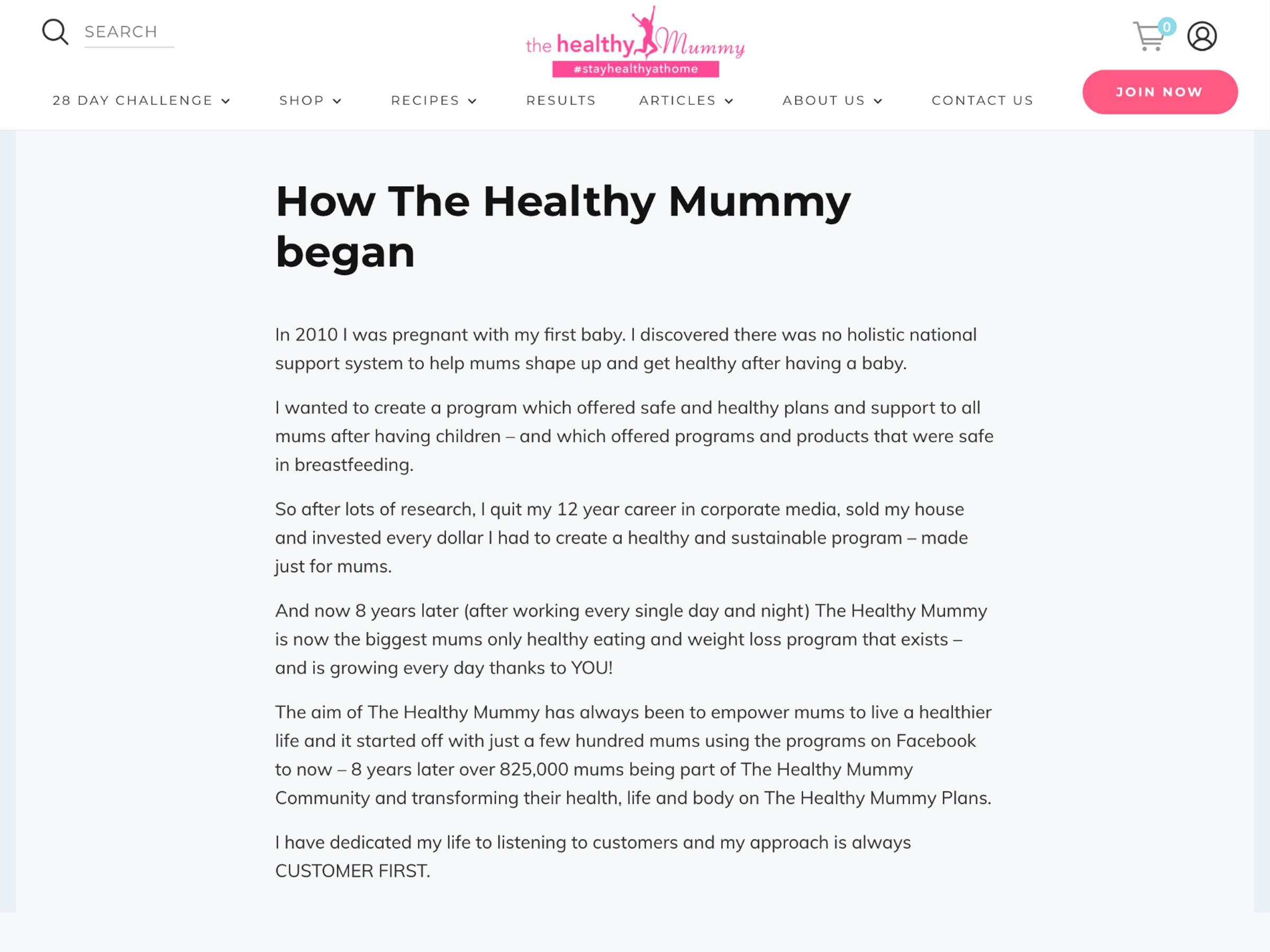
Healthy Mummy is an all-around resource for moms. From helpful content and recipes to health and beauty products, they work to support other moms.
Again, like with Beardbrand, they tell the personal story of how they got started and why they thought this was something missing out there.
It is effective because she’s an authority in the space.
9. Kippins
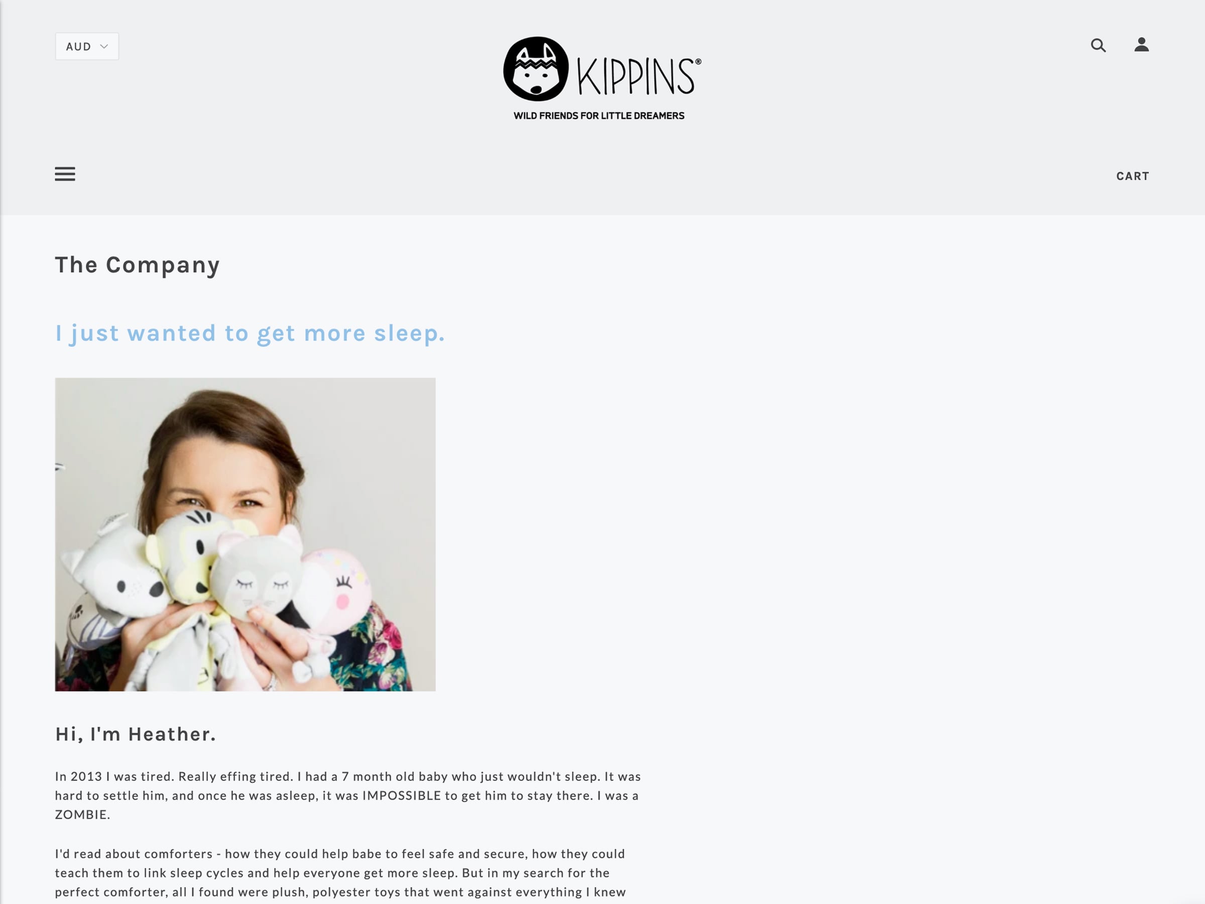
Kippins, an Australian baby clothing brand, keeps it real in their About Us page. Many parents can relate to the crippling desire for more sleep.
So, immediately you have a very close-to-the-heart pain point.
Obviously, they must have an answer. The unvarnished frankness of their story appeals to people like her, people who’ve scrolled through endless parent message boards hoping to find THE answer.
Sometimes, short and simple is best. It really depends on your audience, and possibly how sleep-deprived they are.
10. Bonobos
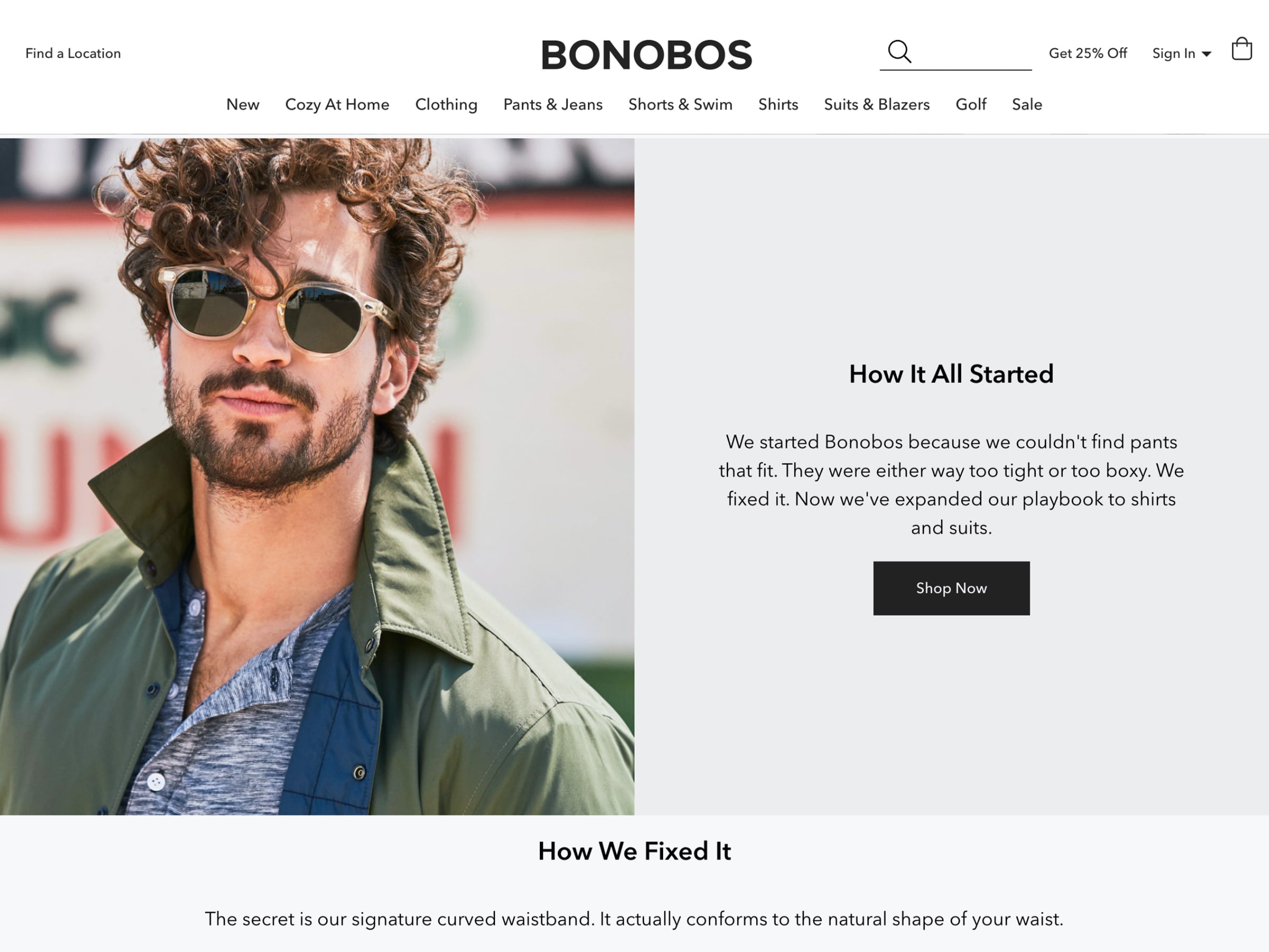
If you are looking for a short but chic example, this one's for you. Bonobos has gotten big in the last few years, offering tailored fashion for men.
Their About page simply sets up pain points (so many pants just don’t fit) and describes why they are the answer. They started the brand because they were annoyed. For men who feel this same way, Bonobos is hitting the right buttons immediately.
They keep it short while quickly telling their story. And that’s super effective.
11. Simétrie
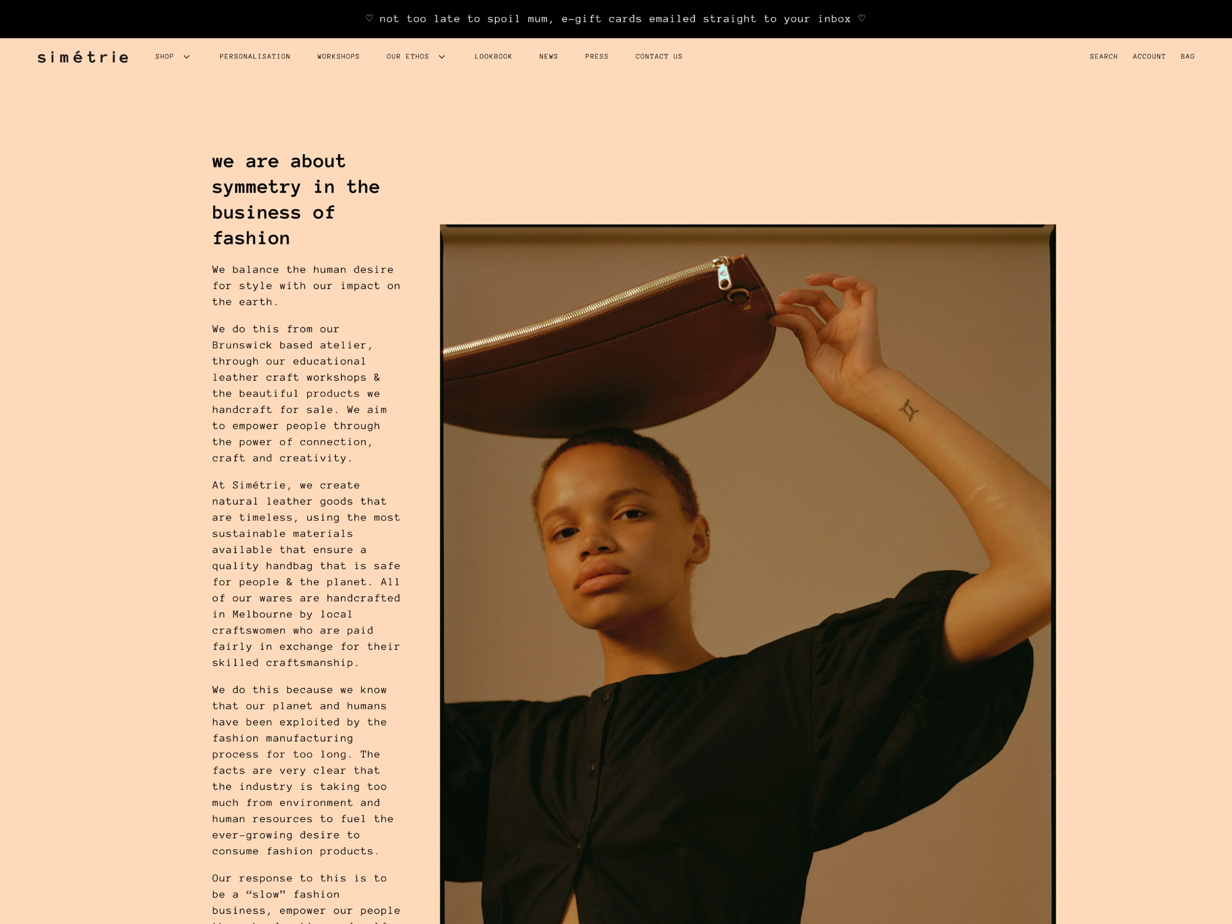


Simétrie is an Aussie slow fashion label that focuses on creating sustainable and ethical bags. Their Our Ethos page breaks down their brand into five basic ideas, each juxtaposed with a stunning photo highlighting their products.
They want you to know that it isn’t really about them, but instead what they stand for, their ethos. The brand is defined by their process and that process underpins their core ethics.
It is so effective because it speaks to the very shoppers that prioritize sustainability in their consumer decisions.
From the lens of marketing, it helps their audience become more comfortable with the brand and pushes them through the sales funnel.
It’s about time you started on that page
So, now you know why an About Us page is important and why you need to have one. Not just any, but a cleverly yet concisely written About Us page.
It does not matter what type of site you have. What matters is what you can do for your target audience.
With these examples and general guidelines, you can start creating your own About Us page.
Remember, making a great first impression on your customer is key for building a lasting relationship. So, opt for clever and easy to read over developing your PhD thesis.
Nobody is here for all that.


