A logo identifies. It can be telling without saying a word. A really great logo sticks with you and inspires confidence in a brand. It’s the beginning of a conversation with potential customers and future competitors.
Its strength is in:
- how a company is recognized
- how it is recalled among its peers and
- establishing a connection between a brand and consumers.
Designing a logo takes more than just waiting for the lightbulb to appear magically above your head and bringing it to life on a piece of paper. Professional logos take time to ideate, brainstorm, edit, rethink, and ultimately come to life.
After all, you’ll be plastering this thing on every little company thing you can—business cards, your socials, any swag you may have planned, and real-world real estate if you go the brick and mortar route.
So, before you dust off your sketch pad, here are a few considerations to keep in mind when dreaming up your logo.

How to create a logo for your business, step by step
You have to start from the start, so let’s go step by step to help you devise and ultimately create your brand’s fresh new logo.
Hone your brand identity
You want your logo to communicate and build your brand’s identity. This may require some pre-work to understand, inform, and flesh out what that identity actually is.
So, here are a few questions to jump-start the process:
- Why did you start the business?
- What is its purpose? And what do you want it to achieve?
- What beliefs and values are central to the company?
- What do you do better than your peers?
- If you could describe the brand in a few words, what would they be?
- How do you want customers to describe you?
- How do you want customers to feel when they think about you, your products, or your services?
Once you have developed your brand identity, you can begin to tell your brand’s story. Start with evoking an emotional response.
Marketing specialists say buyers connect more strongly to storytelling than to facts and figures.
Of less interest than what you do is why you do it. Your sense of purpose and values will help you to better connect with consumers.
From there you can begin to shape the design.
Fit in and stand out
Consumers understand and perceive brands by their logos and packaging.
For instance, eco-conscious brands are known to adopt colors like green and brown to show sustainability and earth friendliness.
Based on your industry and product or service type, undertake your own research to identify what your peers are doing.
When it comes to logos and packaging, brands need to fit into their category so consumers can make sense of the product.
But there is also wriggle room to stand out so you don’t get lost in a sea of sameness.

Get color wise
As mentioned, color psychology can impact human behavior. Color can inform shopping and decision-making.
Did you know?
- Color influences 85 percent of shoppers’ purchase decisions
- 93 percent of shoppers focus on visual appearance only when they consider a purchase
- Colors increase brand awareness by 80 percent
So it’s clear that selecting colors goes beyond what’s pleasing to the eye. There are strong commercial and strategic reasons to be smart about color choice.
Understanding the meanings behind colors and the emotional responses they can elicit when it comes to your branding can be very useful.
How friendly is your font?
Font psychology can help to drive design decisions that align with your brand.
It allows you to choose the right font for your designs and gives greater control over how your design is perceived by consumers. There are broadly four font types.
Serif fonts
Serif fonts have detailing which can look more formal and are commonly aligned to appearing classic, high-end, and formal.
They are versatile and can work well with vintage, elegant or timeless designs.
The Dunbar House is a heritage, landmark destination for private events and weddings in the sought-after Watsons Bay area in Sydney. The logo’s intricate motif and serif font help to solidify the brand’s identity as a high-end venue.
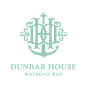
Photo courtesy: Dunbar House
Sans serif fonts
Sans-serif fonts work well with a modern and clean look. This is synonymous with fashion retailer Witchery’s logo which aligns with its bold, modern, and quality-led collections.
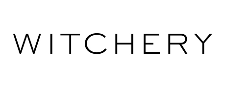
Photo courtesy: Witchery
Script fonts
Script fonts are reminiscent of handwriting. From regal calligraphy-esque fonts to relaxed scripts, there is a varied scale to choose from.
Script fonts are effective at making logos appear unique and individualized. They often convey a sense of authenticity.
The Blue Room’s script font is in keeping with the venue’s theme of relaxed beachside elegance. The hand-drawn script conveys a sense of originality in line with the venue as a one-off exclusive destination, not a franchise.
![]()
Photo courtesy: The Blue Room
Display fonts
Display fonts are decorative fonts that are highly stylized and eye-catching.
Anita’s logo is whimsical and playful, reflective of the brand’s inventive and unusual gelato flavor combinations.
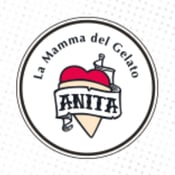
Photo courtesy: Anita gelato
Whatever font style you choose, avoid overly trendy fonts. Trends are short-lived and what is popular today may date quickly.
Time to get creative
There are a bunch of logo makers to help you kickstart your logo-making journey.
Logo creators or logo generators are simple to use, online applications that provide you with the design tools to curate your own custom logo.
Popular choices include Canva, TailorBrands, Logo Makr, and Logaster. The level of customization, price, and ease of use will vary.
Logo designers will often have access to a repository of icons and custom colors as well as allow for free-form design.
Logo makers can be free to use, but there may be a cost to download the files. So, not really a free logo but fairly cheap nonetheless. While these can be cost-effective—ranging from $5-$60—bear in mind that the end results may not be as custom or unique as you may want.
An option with a little extra support is using services that allow you to post your brief to a network of designers, a bit like Airtasker.
Options like FreeLogoDesign or DesignCrowd are spaces to create a brief, post it, and receive unique designs in around 24 hours. Once you land on the design you like best, you can download it.
If you’re looking for more hands-on support and a more consultative process, you may consider engaging a design agency or freelance designer to guide you and create a bespoke option for you.
When considering costs, just think about how long this visual branding will live with you. You want to be happy with the end result or you will have to just rebrand in a few years anyway.
Don’t get hung up
It’s great to be clever and have hidden meanings in your design, but you want to avoid the logo being too abstract as it won’t be clear to consumers what your company does.
Yes, your logo is important.
But don’t put pressure on one design to do all the heavy lifting for you: convey a brand’s story, values, legacy, and what it does.
Simple logos tend to be more memorable and are easier to recognize. If you are a florist, it makes sense to incorporate flowers. If you are an optometrist, spectacles are an obvious choice.
Be literal and it will help your customers.
Here are some examples of logos that don’t hide behind abstraction but rather say exactly what they do.
A logo for a bakery and café

A logo for a hardware store
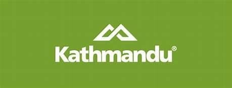
A logo for an outdoor and camping brand
Make it scalable
Logos will represent your company on multiple platforms, channels, and memorabilia—in print, on social media, and online as your business grows.
Regardless of its size or channel, every part of your logo should be legible.
Designers suggest PNG is the best choice for online as it produces a clearer, higher-quality image.
It also enables you to use a transparent background, so your logo can be used on different color backgrounds without compromising its design.
Revise and refresh
A logo does not remain static indefinitely. You should continue to review your logo to ensure it remains fit for purpose.
Most brands adapt and modernize their logos as a part of ongoing brand refreshes every few years.
Nike has been around for the past 50 years. As the company has evolved so too has its logo. The tick or swoosh has become instantly recognizable. So much so that it can endure without its company name which featured in earlier logo designs.
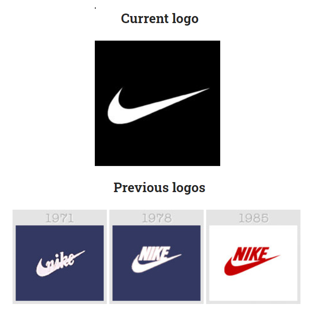
Photo courtesy: Hongkiat
Now, create that amazing new logo
Hopefully, this has given you some food for thought to create your own cracking logo.
There are a bunch of tools (many of them free) available to support your logo-making journey. And if you choose, you can always call on expert advice where needed.
While you’re at it, once you’ve nailed your logo design, consider how your business can benefit from trademarking and legal protections.
For all your shipping needs, you know who to use.